Case study
The Missing View: Turning Scattered Project Data Into One Picture Everyone Can See
Building an internal tool that turns Jira and Tempo data into one shared view of capacity, releases and resourcing, and the PM platform it is becoming.
- Client
- i4T Global (internal)
- Industry
- Field Service Management SaaS
- Role
- Project Manager (product owner and builder)
- Duration
- First version live in weeks, ongoing
Challenge
Release plans, team capacity and who was actually working on what lived in three different places: Jira, a time-tracking tool, and a spreadsheet rebuilt by hand before every leadership meeting. Nobody outside the PM had the full picture, and the picture was out of date the moment it was shared.
Approach
Build the one view that was missing instead of buying another system. Pull real logged time and real project data automatically, let planned work be entered in the same place, and show both on a single timeline that a non-technical stakeholder can read in ten seconds.
Outcome
A live internal tool where planned work and actual effort sit side by side, refreshed automatically, visible to the whole team under invite-only access. It is now the base for a wider platform: one central place for everything a PM manages, open to everyone who needs it.
- 2 (Jira + Tempo)
- Systems unified into one view
- 3 months, week by week
- Planning horizon
- Hourly and on demand
- Data refresh
- None
- Manual spreadsheet rebuilds
The question nobody could answer quickly
Every project manager knows the moment. Someone senior asks a reasonable question, and answering it takes a day of digging.
Can we take on this piece of work in September?
The information needed to answer that existed. It was just spread across three places: the ticket system that knew what work was open, the time-tracking tool that knew how many hours people had actually spent, and a spreadsheet on my machine that knew what was planned but not yet started. None of them talked to each other. So the answer came from me stitching them together by hand, usually the night before a leadership meeting, and it was already slightly wrong by the time anyone read it.
That is the real cost, and it has nothing to do with software. When only one person can assemble the picture, that person becomes a bottleneck for every decision, and everyone else works from guesses.
What I set out to fix
Not “buy a better tool”. The organisation already had good tools; what was missing was the view that combined them.
So the goal was deliberately narrow: one screen that shows what the team is committed to and what the team has actually done, on the same timeline, without anyone updating it by hand.
Narrow was the point. A tool that tries to replace how a team already works has to win an argument first. A tool that only answers a question nobody could answer before gets adopted without one.
How it works, in plain terms
Think of it as a wall planner that fills itself in.
The timeline. Across the top are the next three months, each split into weeks. Down the side are the things you care about, and you choose which: projects, individual people, or whole teams. The same information, three ways of slicing it, because a delivery lead and a resourcing manager are looking for different things.
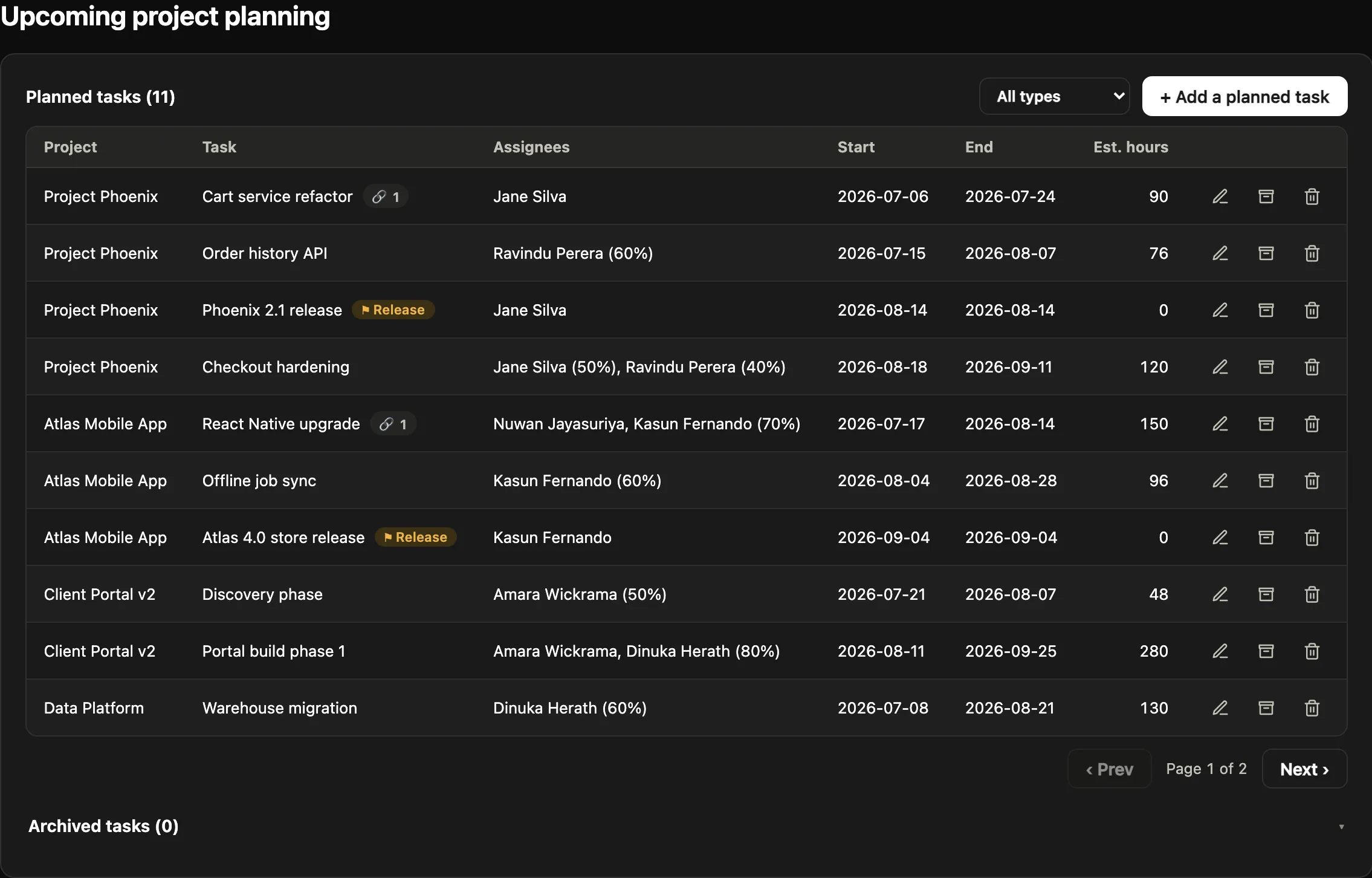
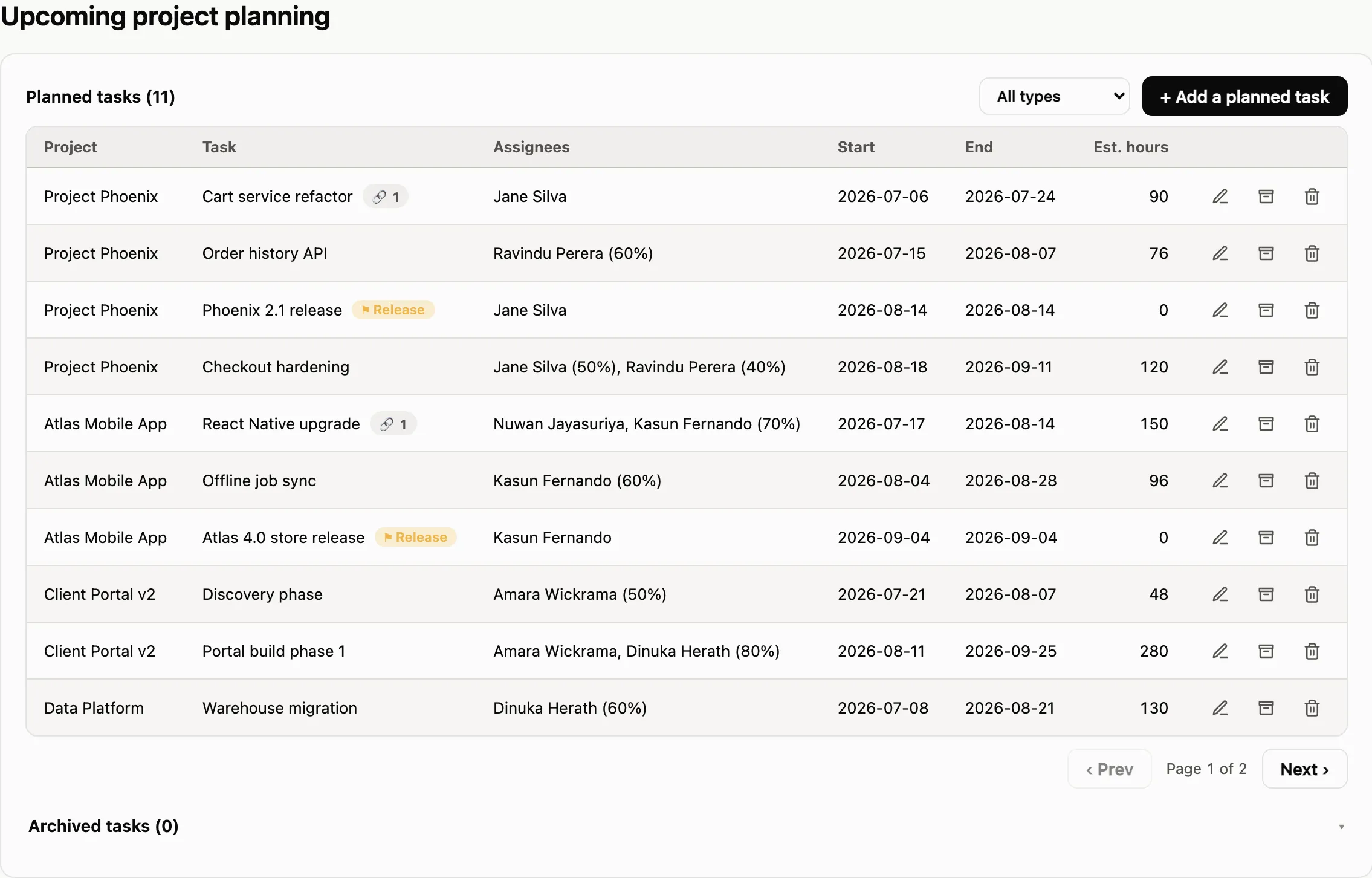
Two kinds of information on one chart. Solid bars are planned work: this project, this person, these dates, this much effort. Behind them sit the actual hours logged that week, pulled straight from the team’s existing time tracking. Plan and reality, in the same glance. The gap between them is usually the most useful thing on the screen.
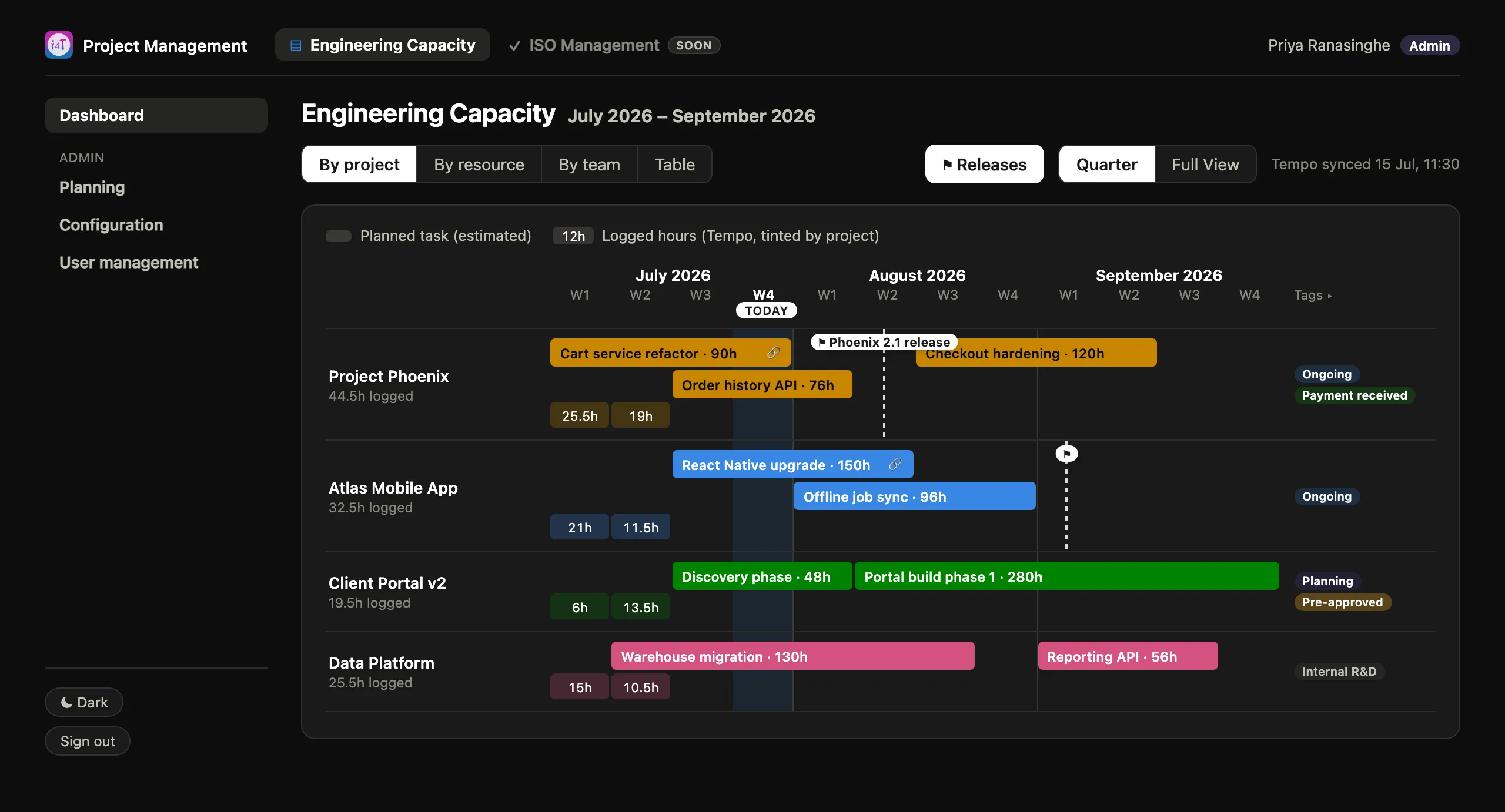
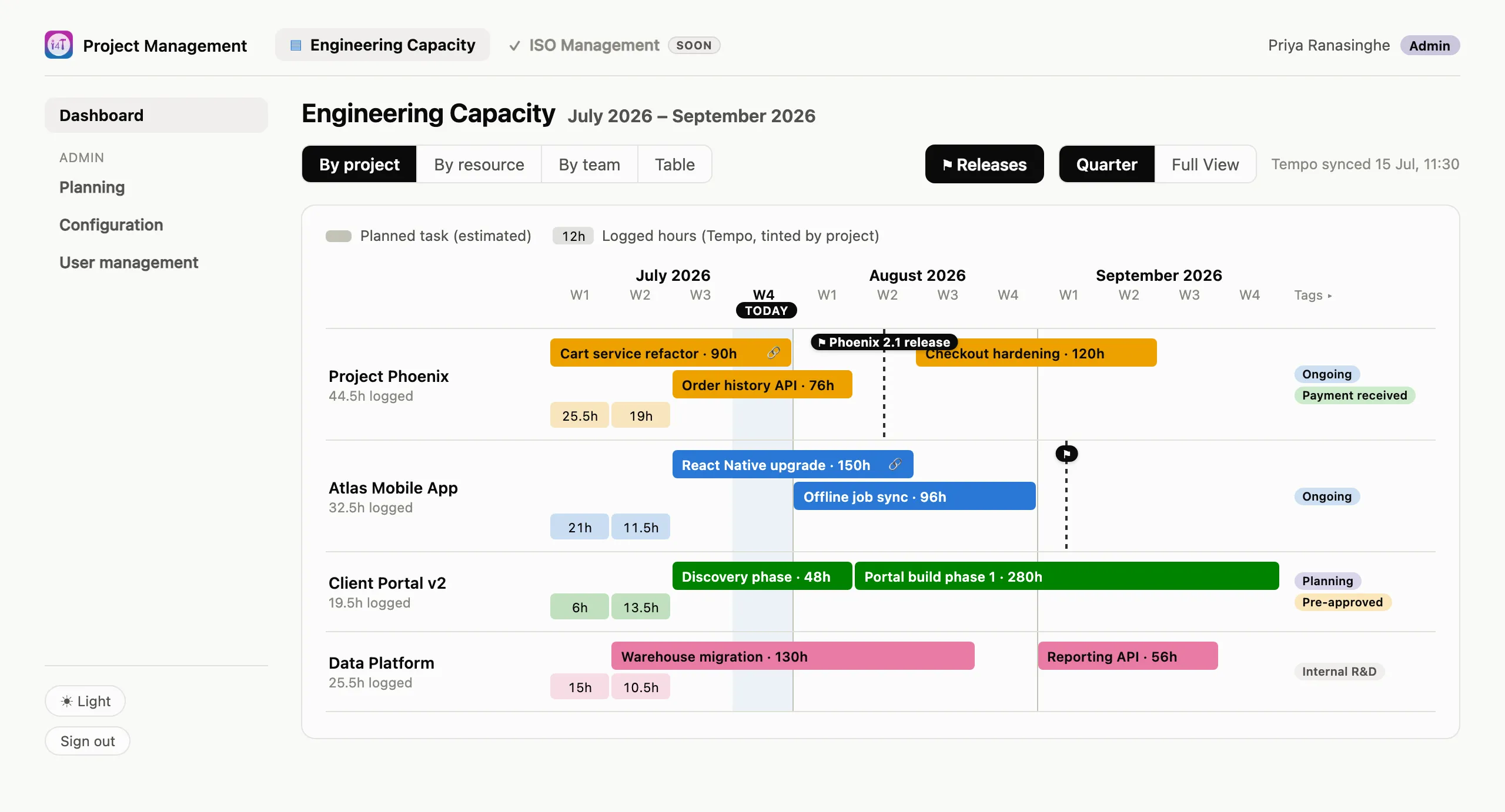
It updates itself. Logged time, the list of people, the list of projects and the teams they belong to all come in automatically from the systems that already hold them. There is also a “refresh now” button for the ten minutes before a meeting when someone has just logged their week.
Over-allocation shows up as a number, not a surprise. Because planned work carries a percentage of a person’s time, the tool adds up everything landing on one person in one week. Anything over one hundred per cent is visible before it becomes a missed date, rather than explained afterwards.
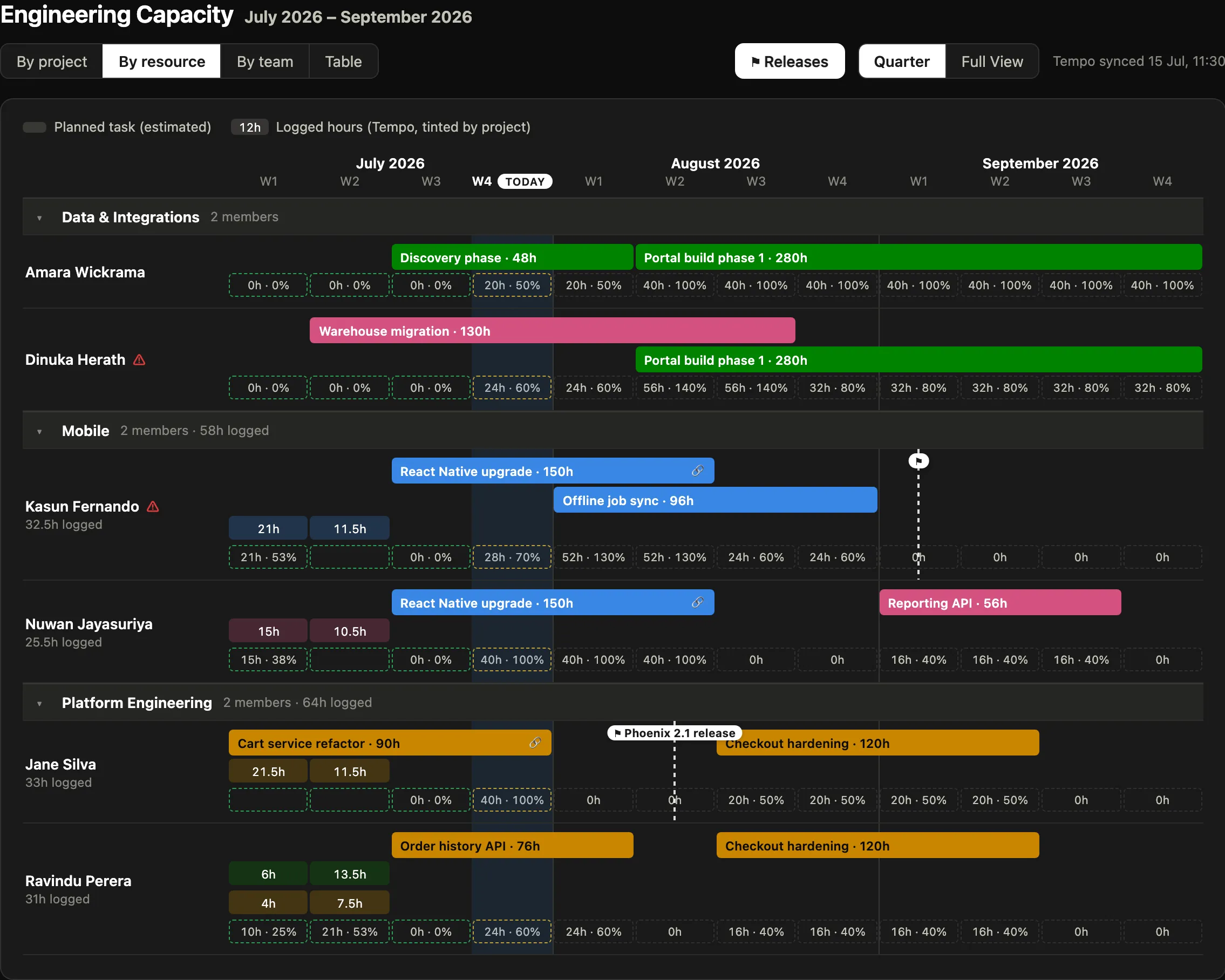
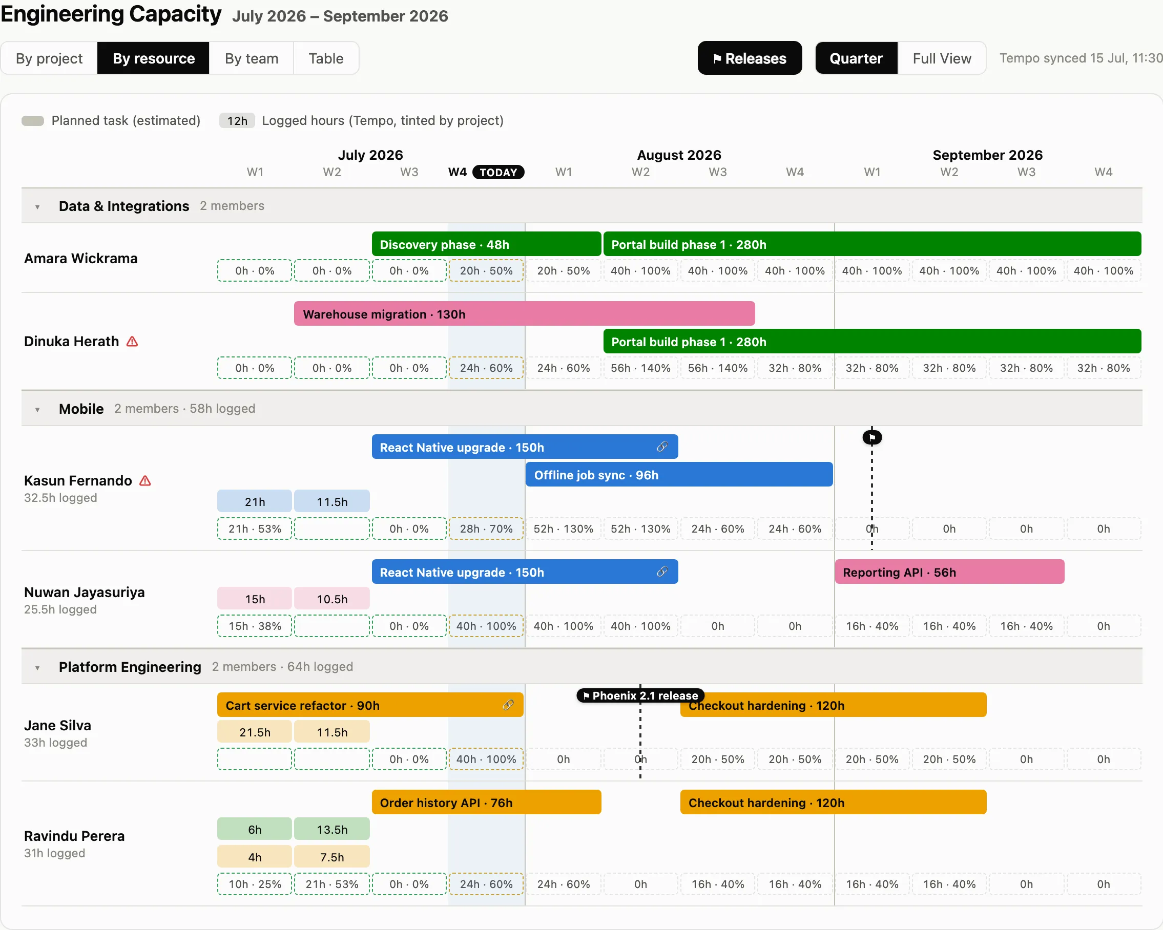
Release markers. Planned releases are flagged on the timeline, so the question “what is going out, and what else is competing for the same people that week” is one screen instead of two meetings.
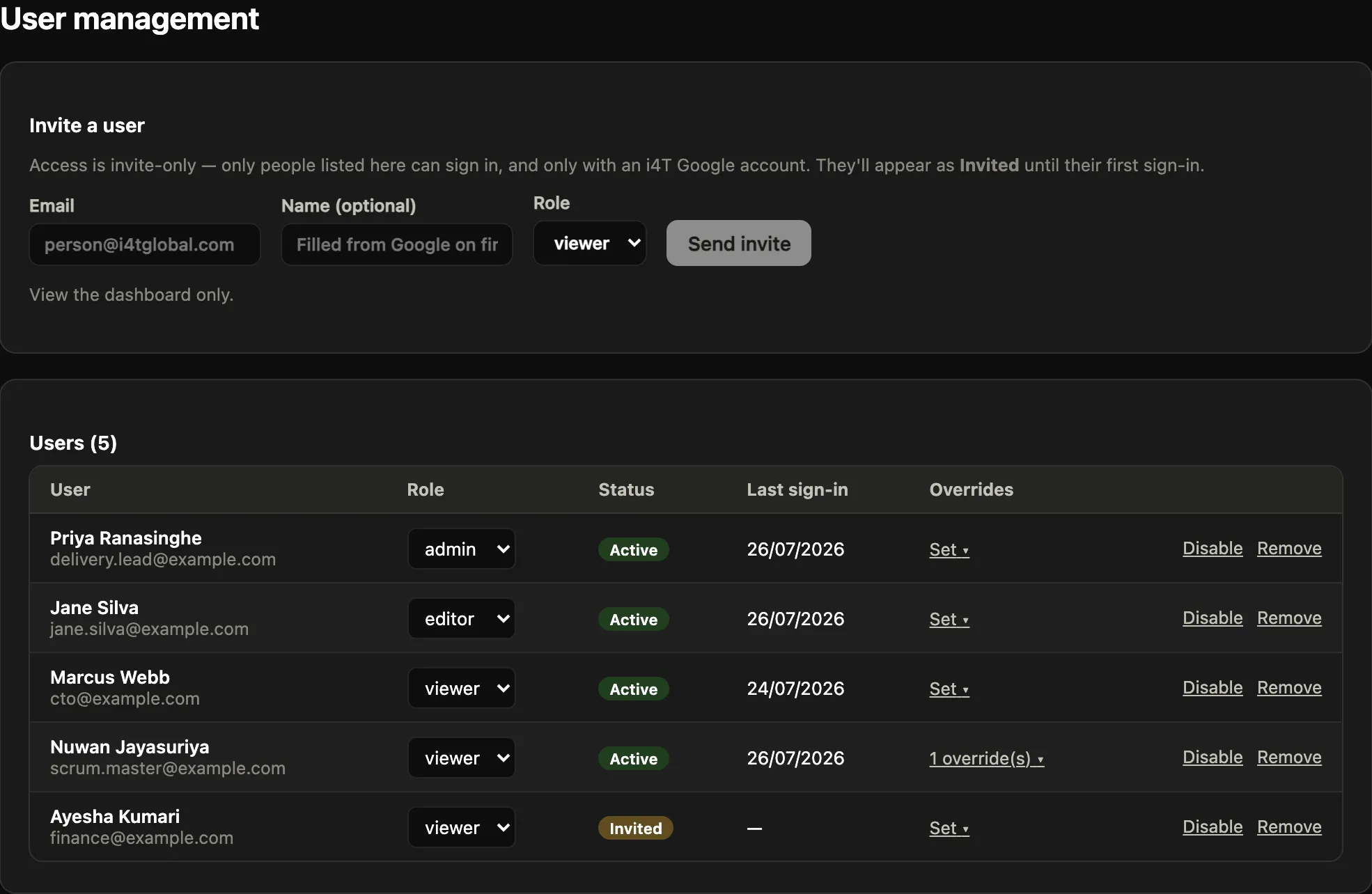
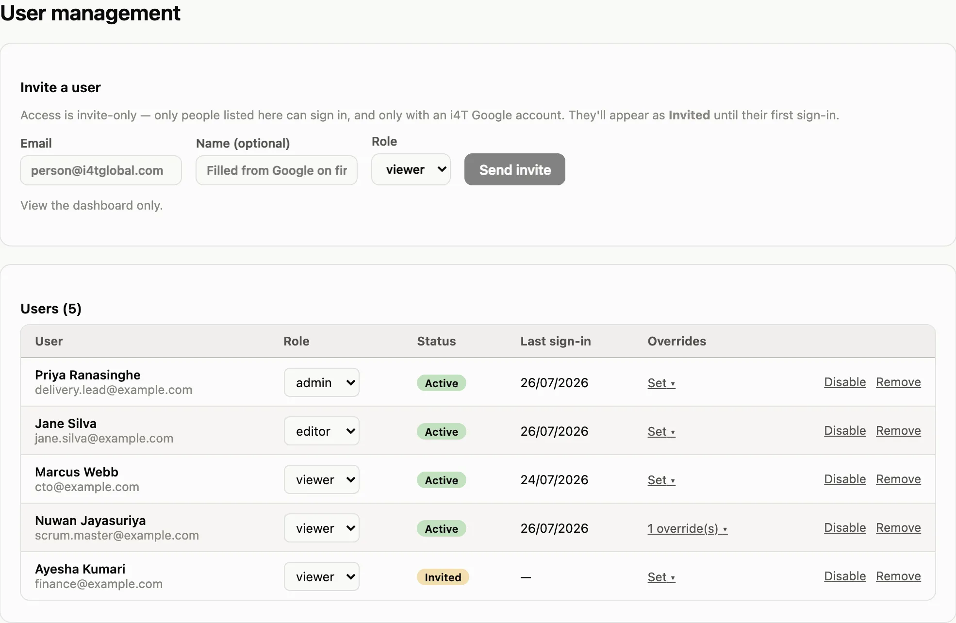
Everyone sees the same thing. This was the requirement that mattered most, and the reason the tool exists at all. Sign-in uses company accounts and is invite-only, and what someone can see or change depends on their role: most people view the plan, a smaller group edits it, and administrators manage access. One dashboard, not one dashboard per audience, so there is no version of the truth that only some people have.
The decisions I would defend
Actuals had to be automatic. Any part of this that depended on someone remembering to update a field would rot inside a month. Planned work is entered by hand because only a human knows it. Everything a machine already knows is read from the machine.
Weeks, not days. Day-level precision looks impressive and is almost always fiction three months out. Weekly buckets are honest about how much certainty actually exists, and they make the chart readable at a glance, which is the whole purpose.
Read-first, not process-first. The tool asks nothing of the team’s daily habits. People keep working exactly as they did; the visibility is a by-product. That is why it did not need a rollout plan.
Built for the meeting it is used in. The first version was designed to be projected in a leadership meeting and understood without explanation. A plain table view exists alongside the chart, for anyone who wants to print it, read it on a screen reader, or check a number rather than a shape.
Where it goes next
The capacity view solved my loudest problem, and then made a bigger one obvious. Capacity is one of many things a PM holds in their head and in their private files: risks, dependencies, decisions, compliance evidence, status reporting. Each one is a different spreadsheet, a different reminder, a different person asking for an update.
So the tool is being built out as a platform rather than a single dashboard. The structure is already there: capacity is the first module, with others (starting with ISO and compliance management) slotting in beside it and sharing the same sign-in, the same permissions and the same audience. The intent is one address a PM works in, and one address the rest of the team looks at, instead of a folder only the PM can navigate.
The principle stays the same as the first screen: if information only lives with the project manager, the project manager is a single point of failure. The point of building this is not efficiency. It is that a team which can see the plan can participate in it.
What I have taken from it so far
- Build the missing view, not another system. Every question that took a day to answer was a joining problem, not a data problem.
- Anything that needs manual upkeep will be out of date. Automate what is already known, and ask humans only for what only humans know.
- Vagueness at the right resolution is more honest than precision at the wrong one. Weekly buckets survive contact with reality; daily plans three months out do not.
- Visibility is a management decision before it is a technical one. The hard part was not the chart. It was deciding that everyone should see the same numbers I did.